Visual Storytelling
Defining brand identity through original imagery. I direct visual languages that move beyond generic stock to build owned, authentic asset libraries that anchor the brand story.

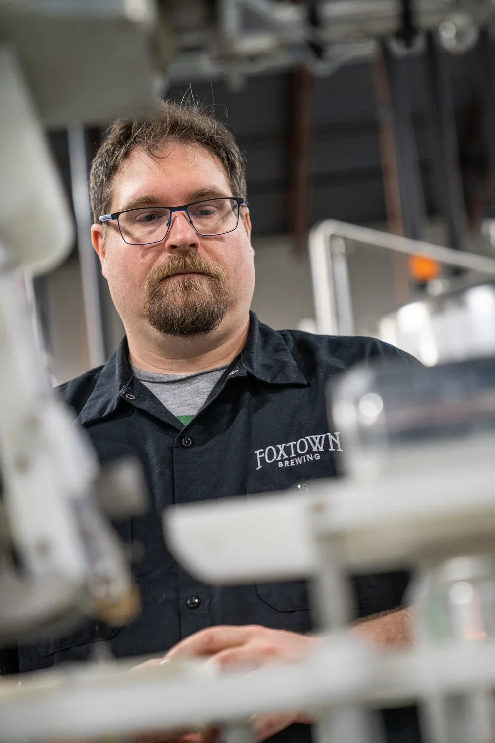

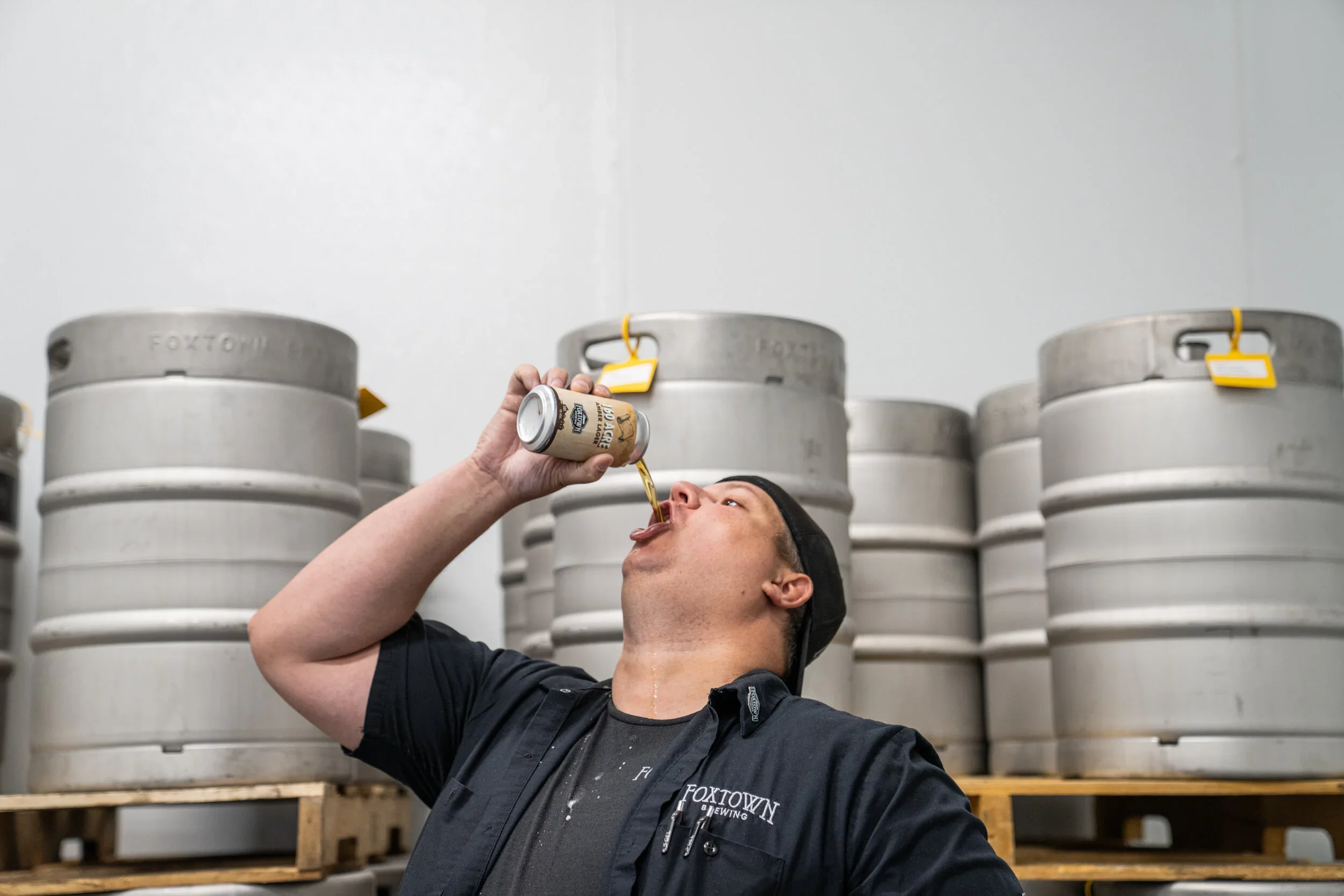
Foxtown Brewing
Defining the Visual Soul of a Startup
Role: Creative Lead & Principal Photographer
THE CHALLENGE: Launching a new craft beer brand in a saturated market is difficult. Foxtown needed to look established and premium from Day 1, avoiding the "homebrew" aesthetic while still feeling authentic to its Wisconsin roots.
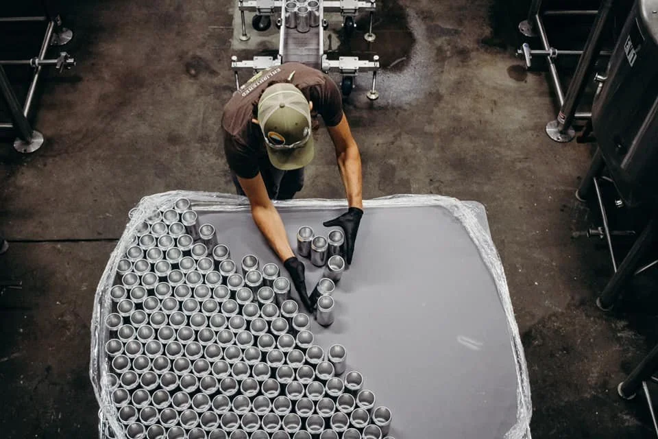
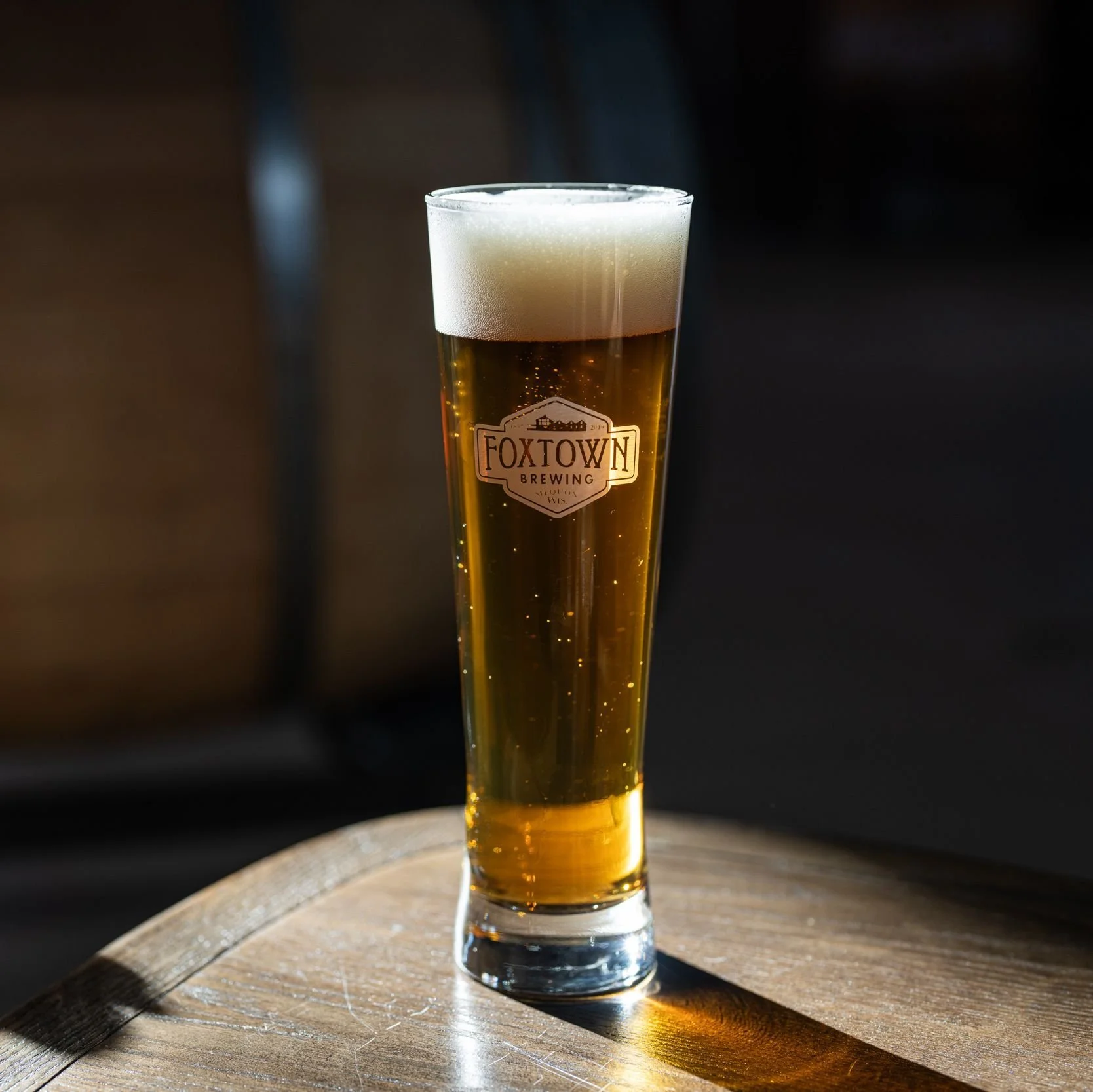
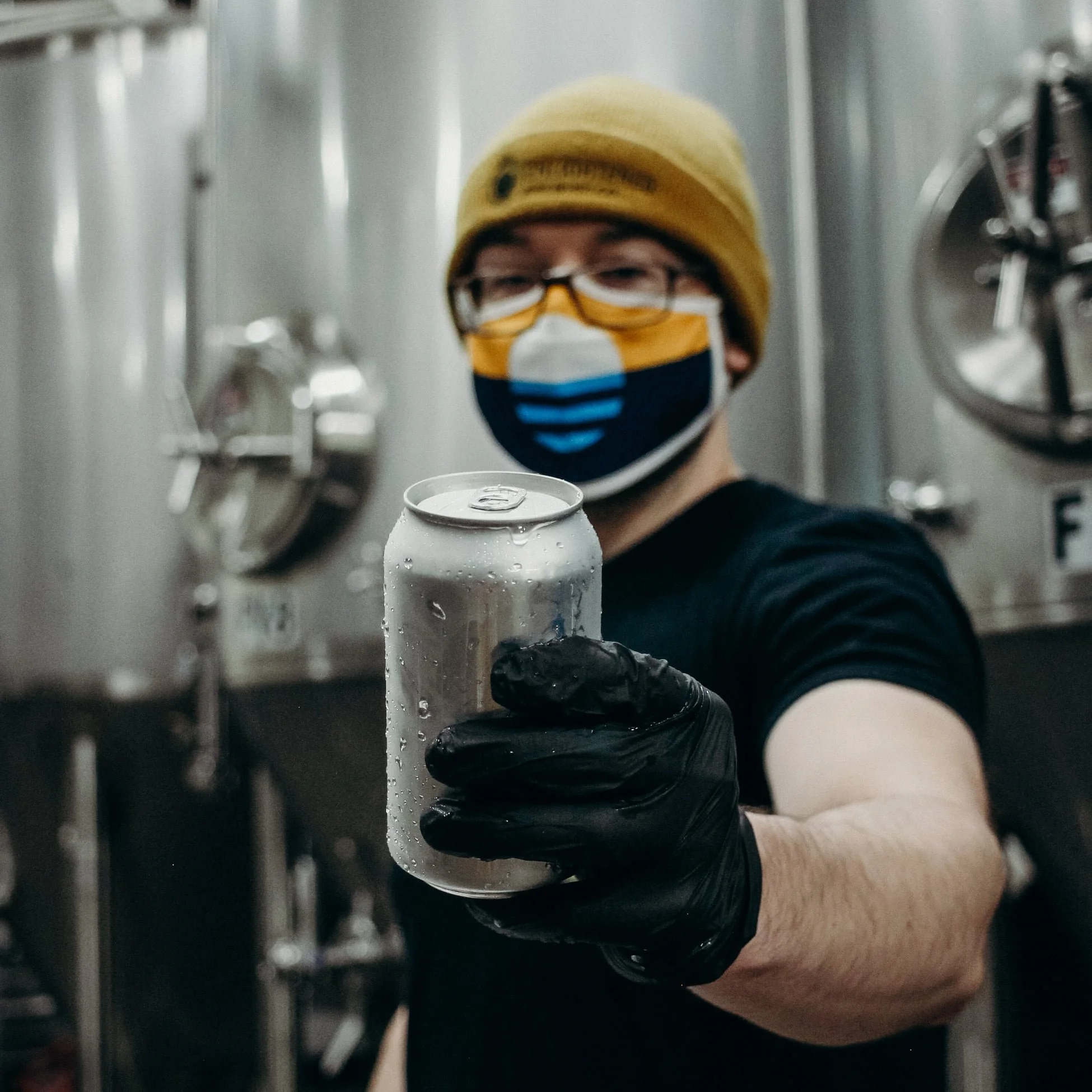
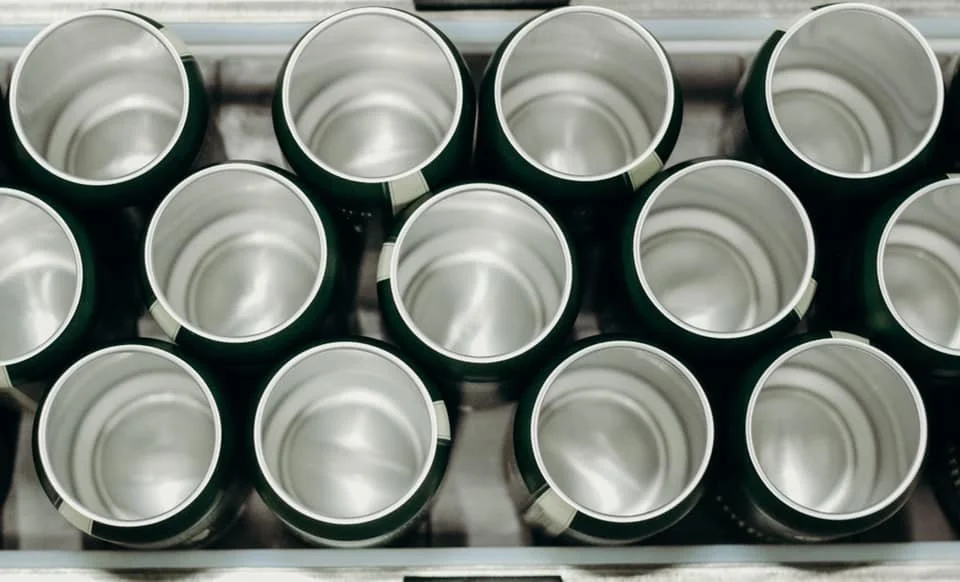
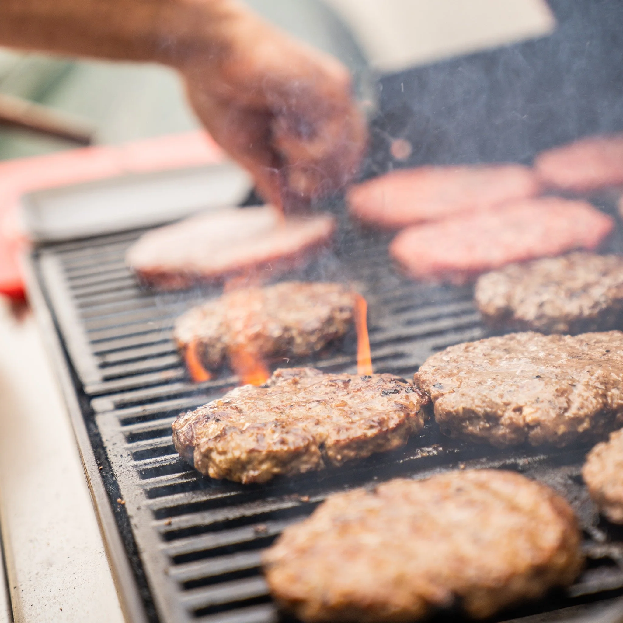
THE VISUAL STRATEGY: I directed and shot a photography library centered on "Industrial Grit." We moved away from polished, commercial product shots to focus on the textures of the process.
Authenticity First: By capturing the actual brewers, the steel, and the workspace without staging, we established immediate trust and heritage.
Light & Tone: The visual language utilized natural light and high contrast to reflect the "hands-on" quality of the product.
THE RESULT: A comprehensive library of owned assets that defined the brand’s launch across packaging, social, and web—positioning Foxtown as a premium, blue-collar staple immediately upon market entry.
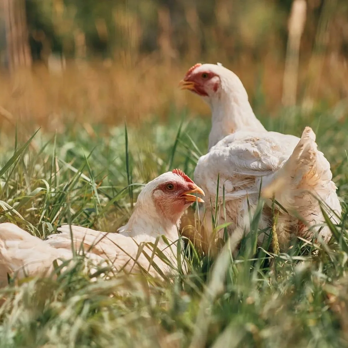
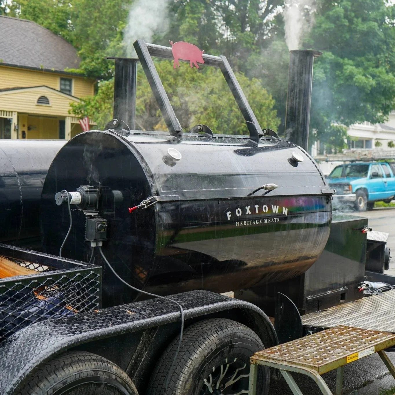


Foxtown Heritage Meats
Visualizing Farm-to-Table
Role: Creative Lead & Principal Photographer
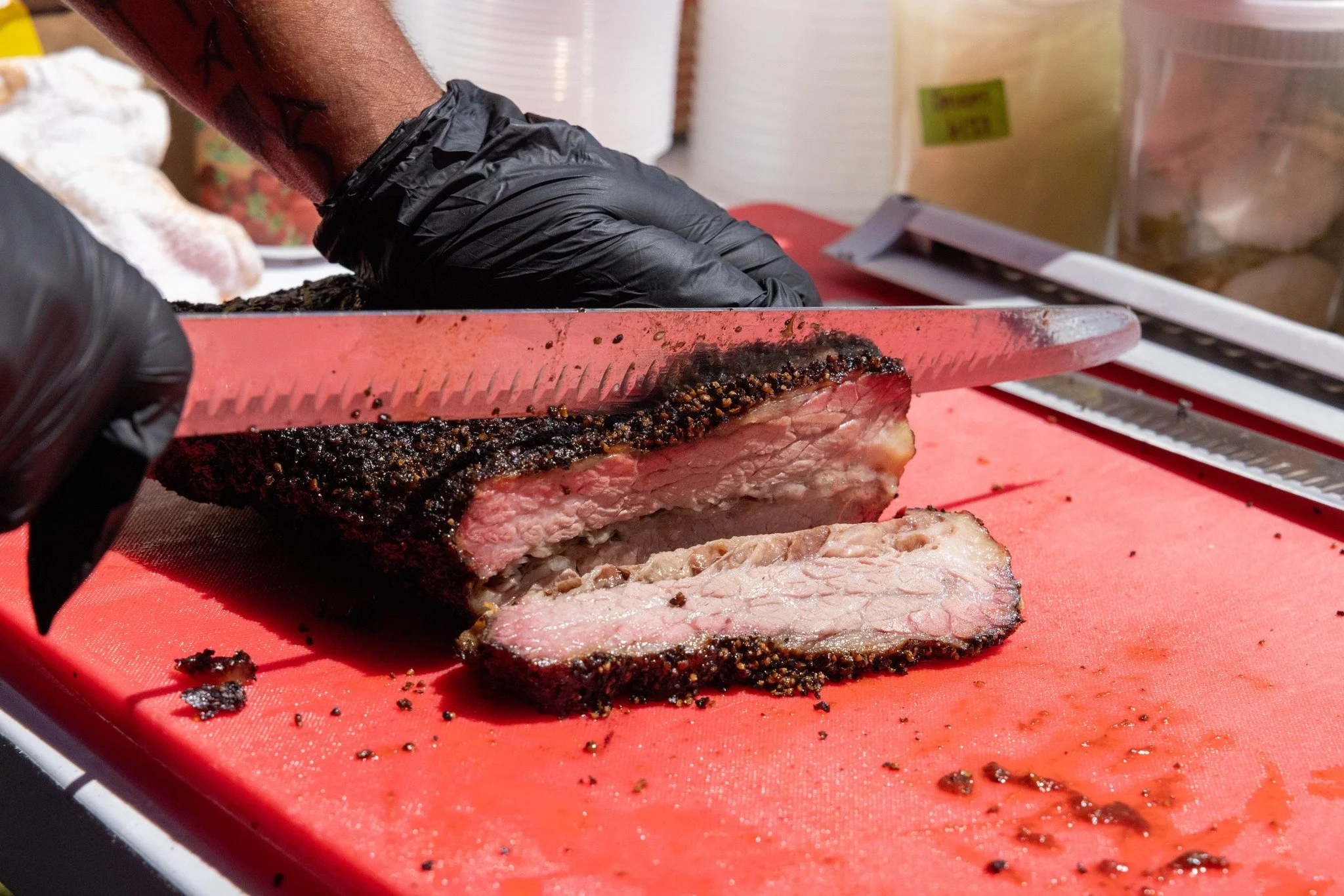
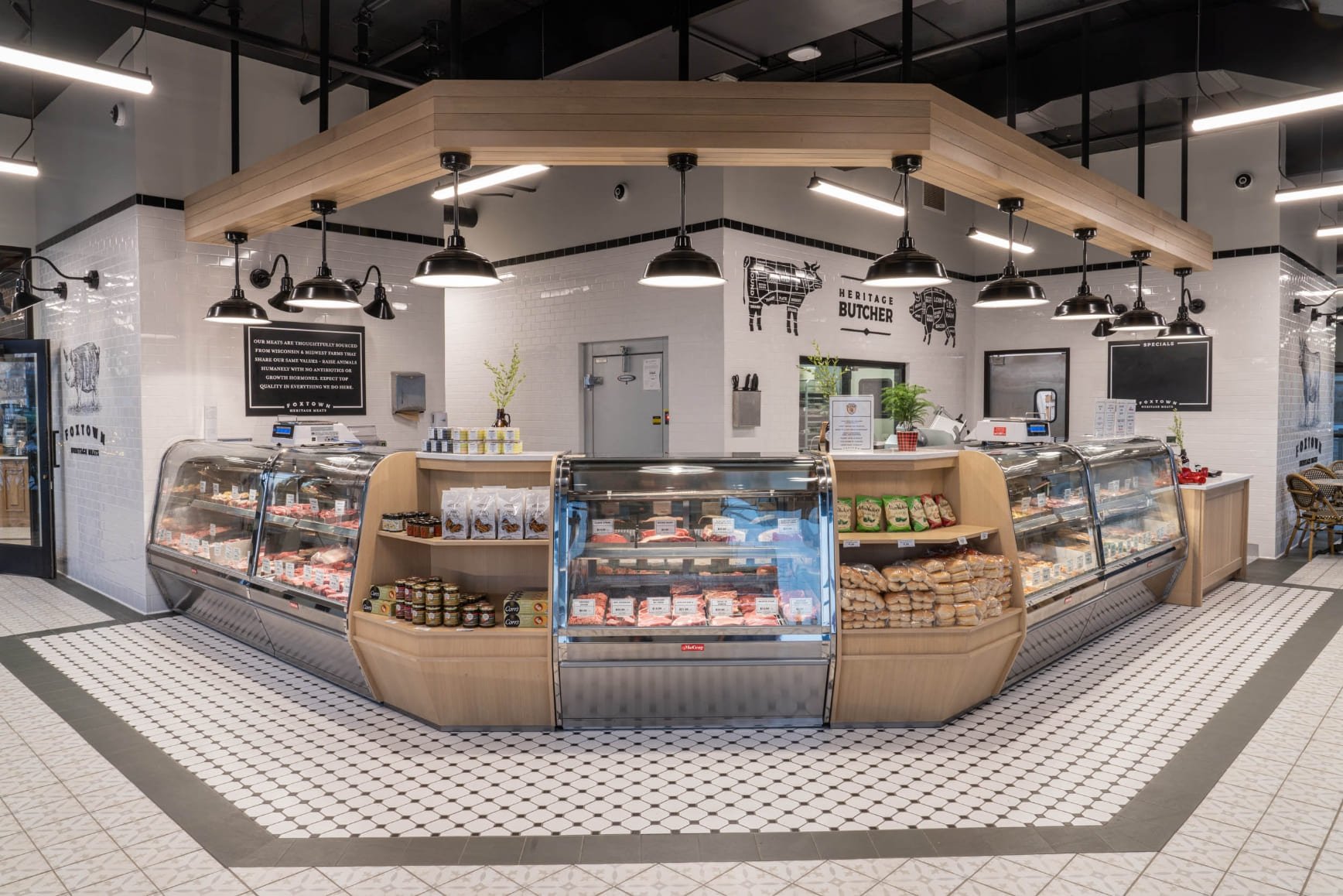
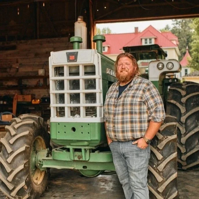
THE CHALLENGE: In a market flooded with commodity meat, Foxtown Heritage Meats needed to justify its premium position. The goal was to move the consumer focus from "Price per Pound" to "Value of Craft."
THE VISUAL STRATEGY: I directed a "Source-to-Serve" visual narrative. We deliberately bypassed standard "beauty shots" of cooked food to focus on the Provenance.
Transparency: We shot on-location at the farms (the source) and at the smokers (the craft) to provide visual proof of quality.
The Human Element: The portraiture centered on the butchers, framing them as artisans rather than service workers, elevating the perceived value of the product.
THE RESULT: A cohesive visual identity that served as the foundation for the brand's "Honest Food" messaging, driving trust and differentiating the butcher shop as a destination for conscious consumers.
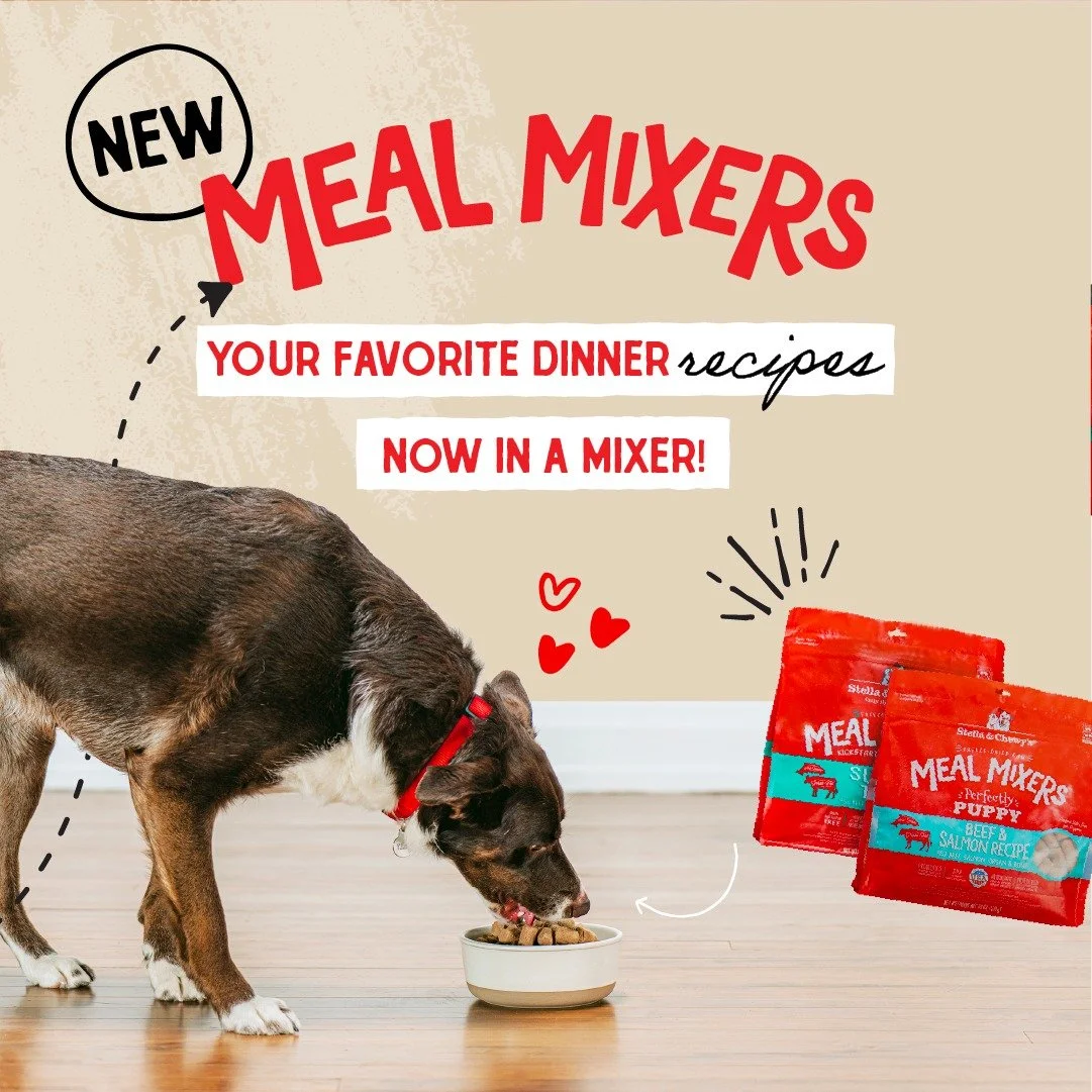
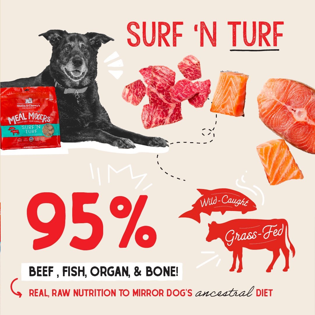
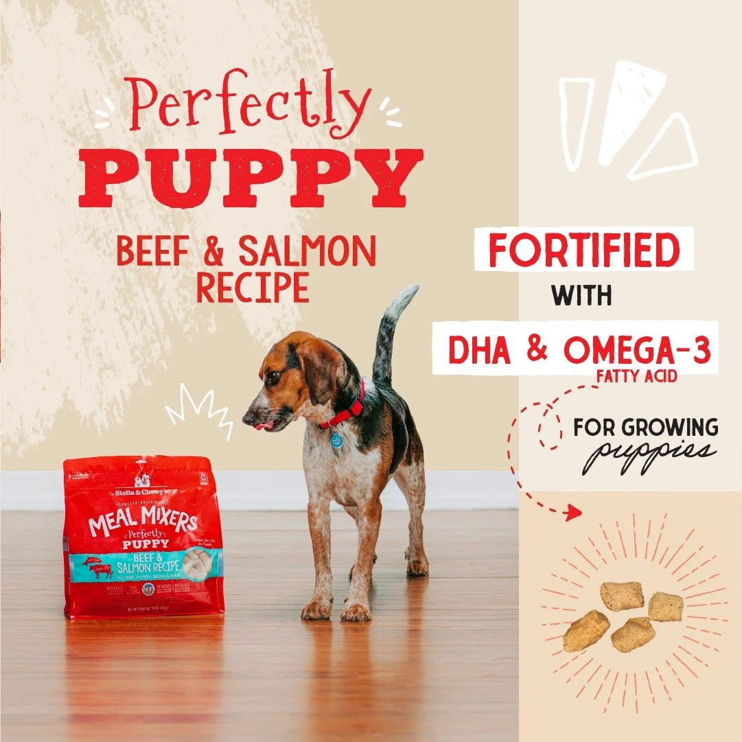
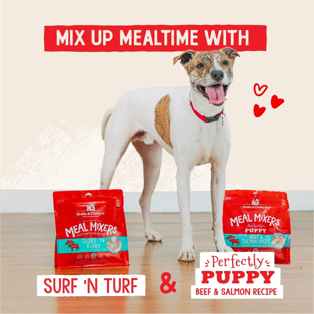
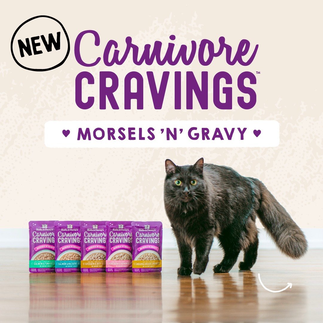
Stella & Chewy’s
Visualizing "Raw Love" through Mixed Media
Role: Lead & Art Direction
THE CHALLENGE: Pet food marketing often falls into two traps: overly clinical (science diet) or overly messy (real raw food). Stella & Chewy's needed a visual sweet spot—imagery that felt "raw and real" but still polished enough for premium commercial placements.
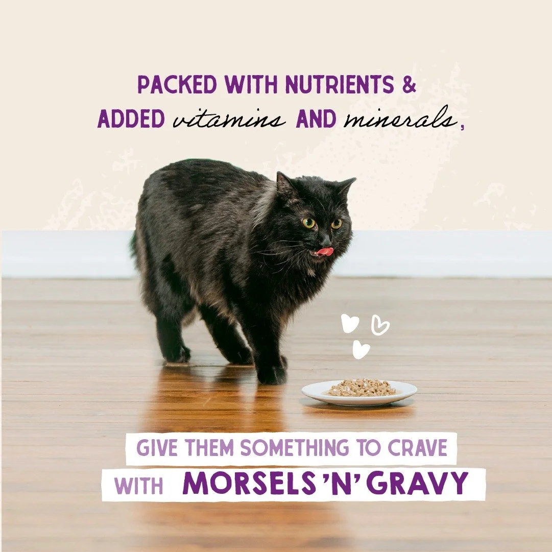
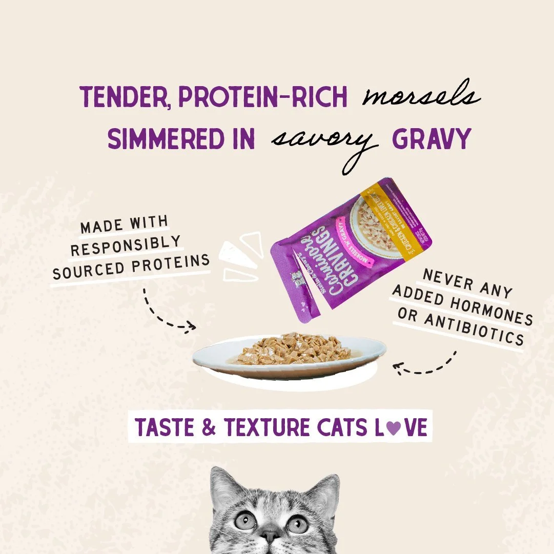
THE VISUAL SYSTEM: I directed a Mixed-Media Strategy that layered high-energy photography with hand-drawn illustrative elements.
The Photography: We moved away from stiff, posed studio shots to capture "controlled chaos"—the actual moment of anticipation and joy when a dog sees the bowl.
The Layering: By integrating hand-drawn typography and doodles directly into the composition, we softened the "raw meat" visual, turning education (ingredients) into entertainment (brand voice).
THE RESULT: A flexible content library that bridged the gap between "high production" and "social authenticity," driving higher engagement rates across digital channels.
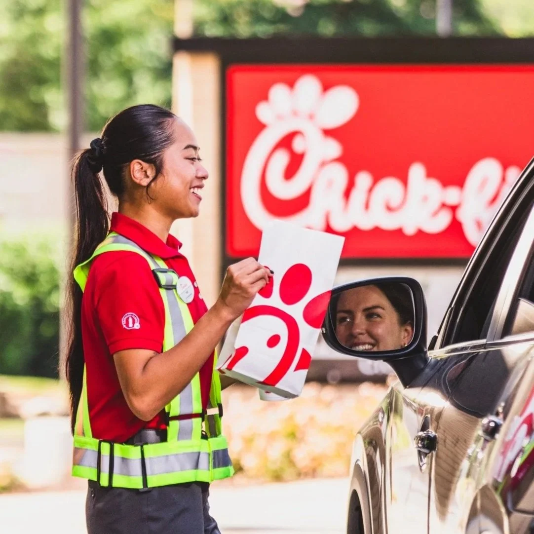


Chick-fil-A
Visualizing "Signature Hospitality" at Scale
Role: Lead Art Direction & Campaign Photography
THE CHALLENGE: Chick-fil-A is built on a specific paradox: Fast Food speed with Luxury Service standards. The visual identity had to mirror this—balancing "crave-ability" (food porn) with "humanity" (service) without ever looking cheap.
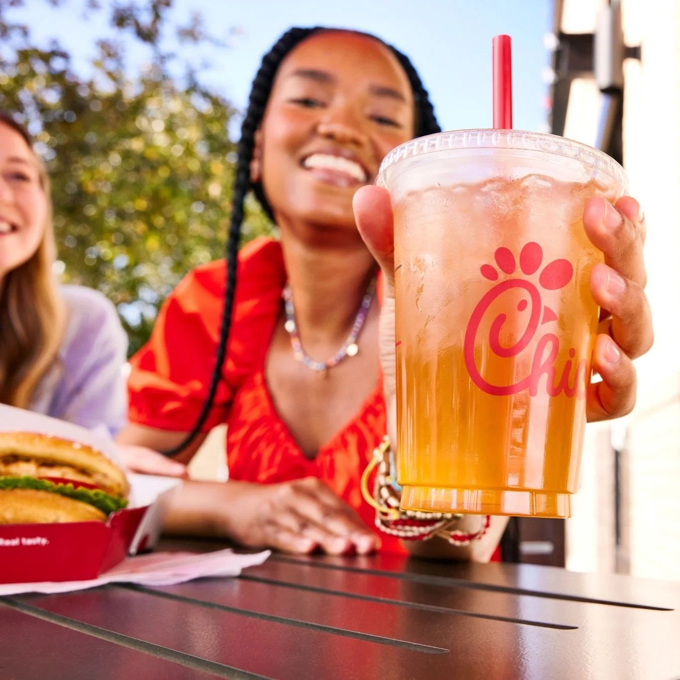
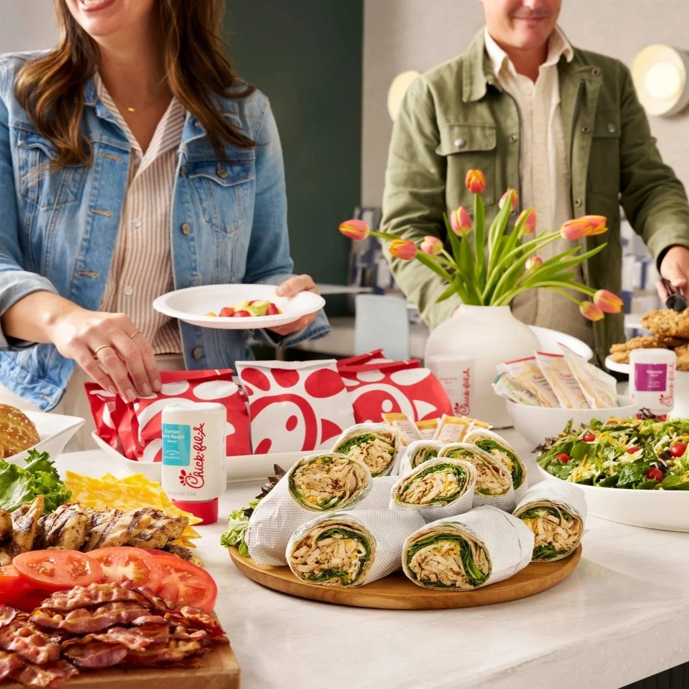
THE VISUAL STRATEGY: I directed a visual language centered on "The Warm Handoff." Whether shooting a catering spread or a drive-thru interaction, the lighting and composition were engineered to feel inviting, not transactional.
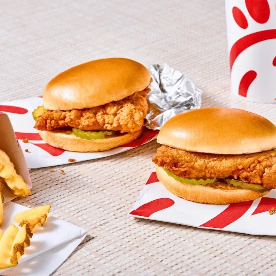
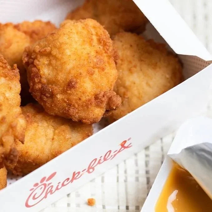
Craveable & Clean: We moved away from hyper-saturated "fast food red" to softer, natural lighting that highlighted fresh ingredients.
Human-First: In lifestyle shots, we focused on genuine connection (eye contact, shared laughs) rather than staged "bite and smile" moments.
THE RESULT: A unified library of national campaign assets used across App, Social, and In-Store displays, defining the "premium approachable" aesthetic that separates the brand from the QSR category.