

Corporate Event
Architecting a Scalable Visual Identity System
Role: Senior Art Director / Designer
THE CHALLENGE: To celebrate a milestone anniversary, we needed to create a celebratory internal brand that felt premium and exclusive, yet remained tethered to Chick-fil-A’s heritage. The system had to be flexible enough to live on everything from high-end apparel and environmental signage to digital internal comms and interactive trivia platforms.
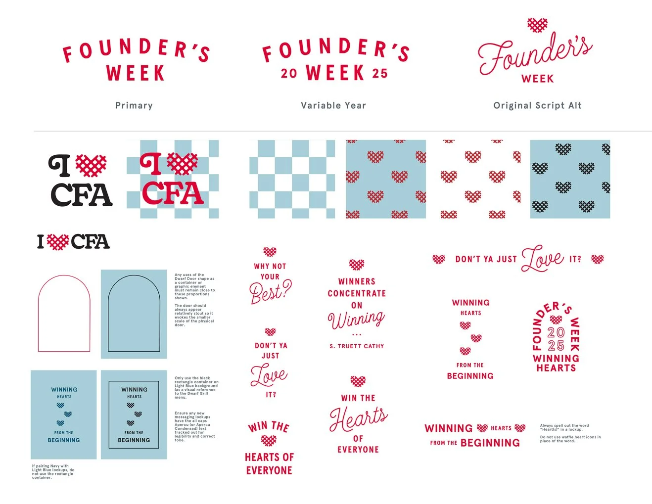
THE DESIGN SOLUTION: I engineered a Graphic Element Toolbox—a modular design system that served as the "Single Source of Truth" for the entire campaign. By moving away from one-off layouts and toward a component-based identity, we ensured total brand consistency across all physical and digital production.
The Toolbox: I developed a kit of secondary marks, variable-year lockups, and custom patterns rooted in the brand’s iconic "Heart" and "Waffle" geometry. This allowed production teams to deploy the brand instantly across apparel, merchandise, and retail assets.
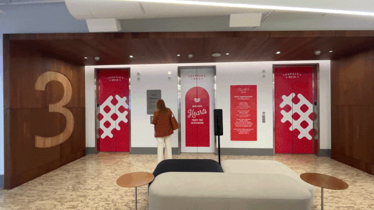
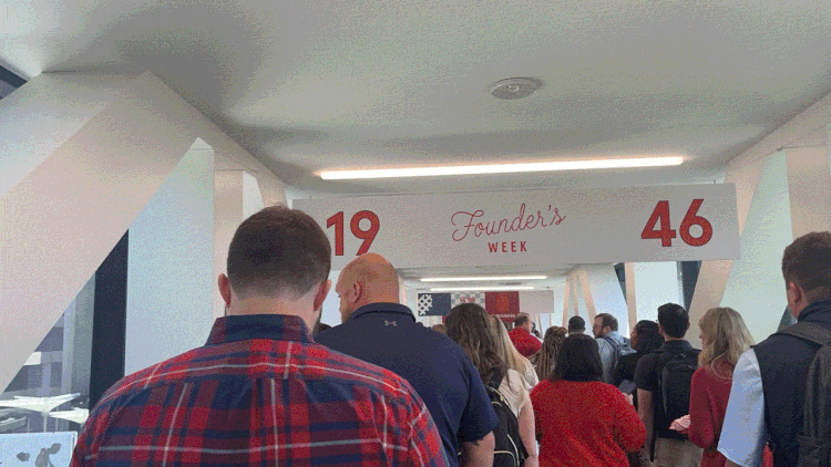
The Environmental Rollout: I directed the translation of this system into large-scale environmental graphics, including elevator wraps, structural signage, and digital welcome screens, ensuring the "Winning Hearts" message felt immersive and intentional in every physical space.
Tactical Execution: From the precision of the typography hierarchy to the hexadecimal color anchoring, I led the "hands-on" creation of all master templates, ensuring that even the most complex production outputs—like all-over print apparel—were technically flawless and brand-safe.
Chick-fil-A Summer Sauce Series
Translating Brand Flavors into Multi-Channel Design
Role: Senior Art Director / Designer
THE CHALLENGE: For the 2024 Summer Campaign, the objective was to elevate Chick-fil-A’s iconic sauce lineup from "condiment" to "hero." I needed to develop a vibrant, high-energy visual language for each individual sauce flavor that could scale seamlessly from 15-second TV spots and social media motion graphics to in-restaurant POS and environmental takeovers.
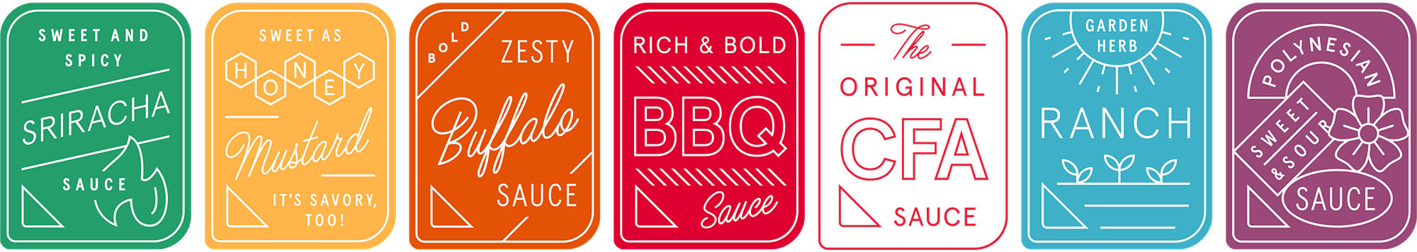
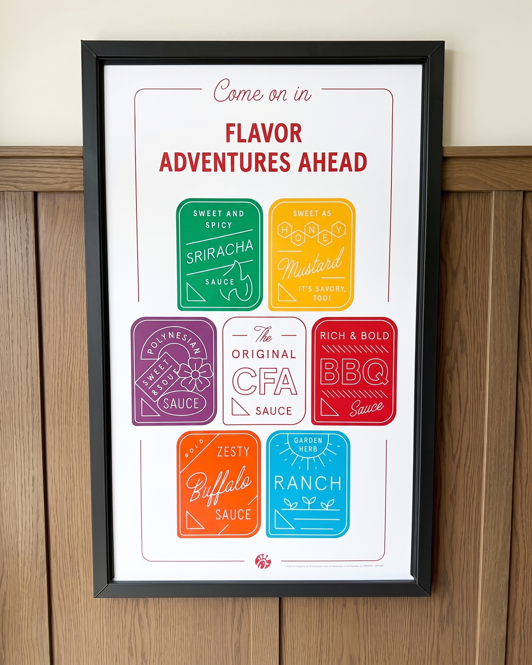
THE DESIGN SOLUTION: I approached the campaign through a Component-Based Design lens. Instead of creating static layouts, I built a library of "Flavor Profiles"—bespoke color palettes, custom typography treatments, and graphic textures—that allowed the production team to pivot quickly between sauce varieties while maintaining a cohesive campaign "soul."
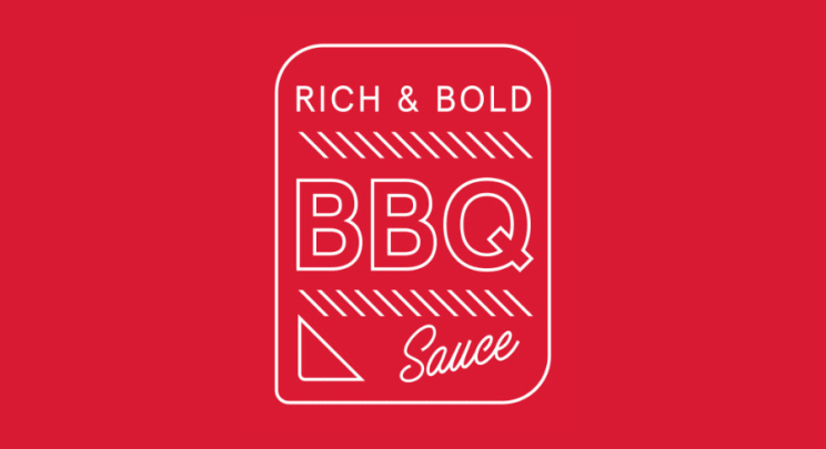
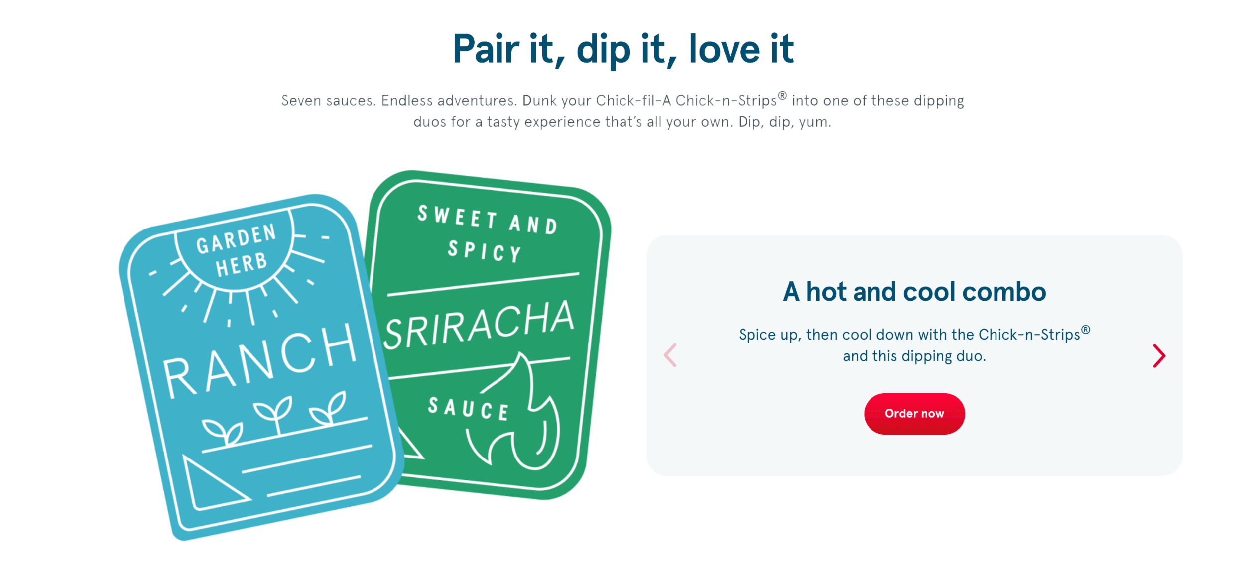
Visual Component Systems: I designed a modular toolkit for each sauce flavor (Honey Mustard, Polynesian, Barbeque, etc.). These included proprietary patterns and "flavor splashes" engineered specifically for high-velocity production, ensuring that whether an asset was a vertical TikTok ad or a horizontal menu board, the brand energy remained consistent.
Production-Ready Craft: I led the "hands-on" execution of the master design templates. This involved balancing high-fidelity food photography with graphic overlays, ensuring that the CTA hierarchy remained clear across every screen size and physical medium.
Omnichannel Scalability: By architecting the files with a scale-first mindset, we were able to deploy the campaign across TV, paid social, and in-restaurant signage simultaneously. I focused on technical precision—specifically color anchoring for print vs. digital—to ensure the "Barbeque Maroon" and "Honey Mustard Yellow" looked identical across all customer touchpoints.
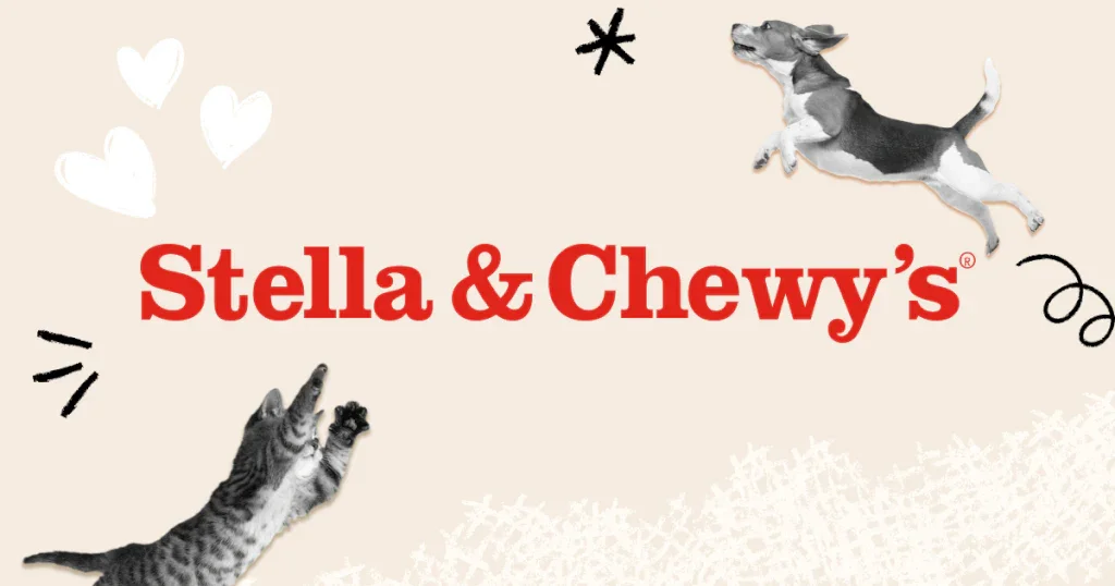
Stella & Chewy’s: Premium Raw Nutrition
Elevating Natural Pet Food through Textural Design
Role: Designer
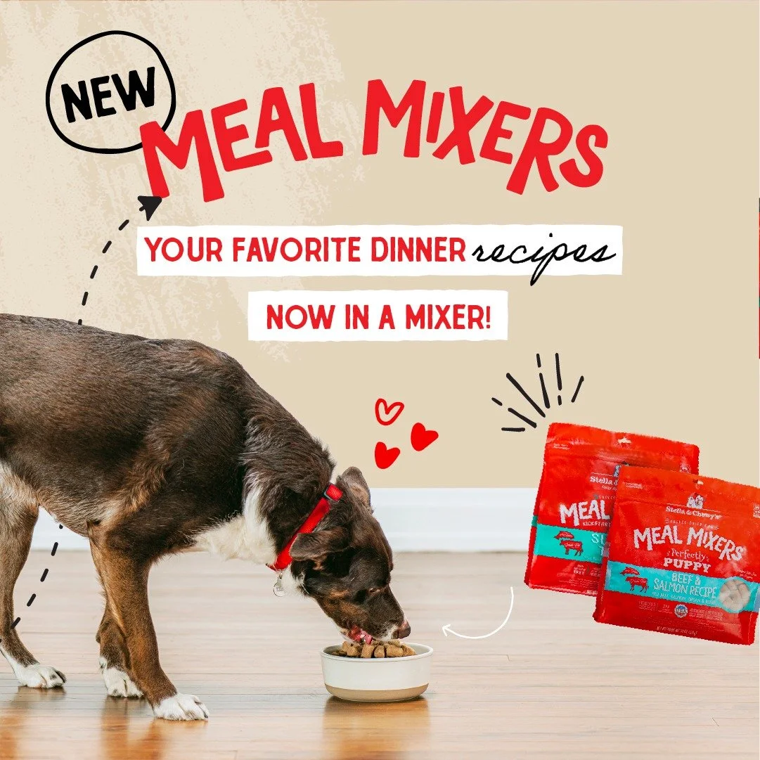
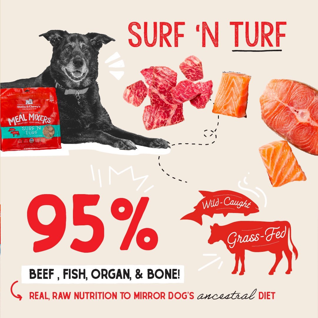
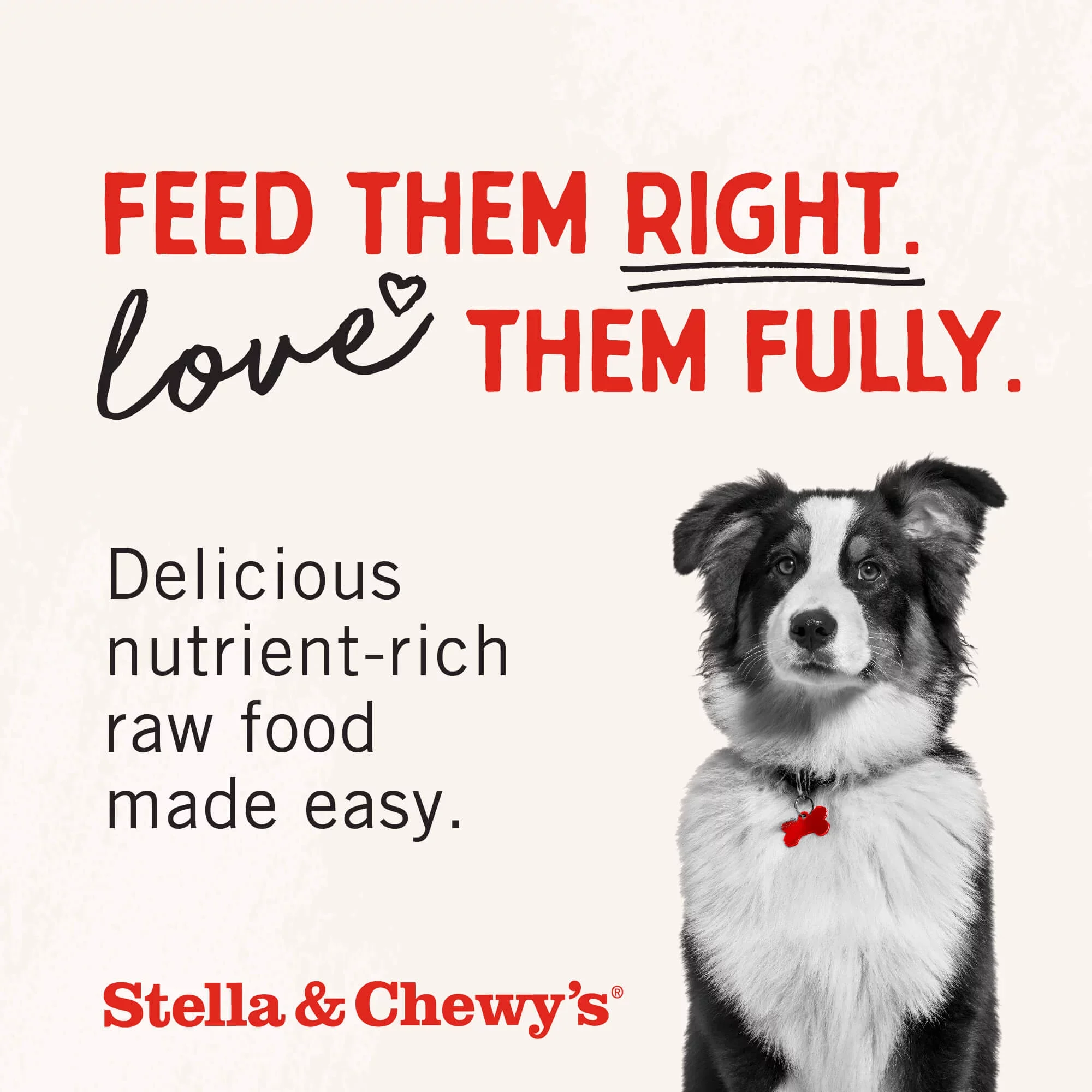
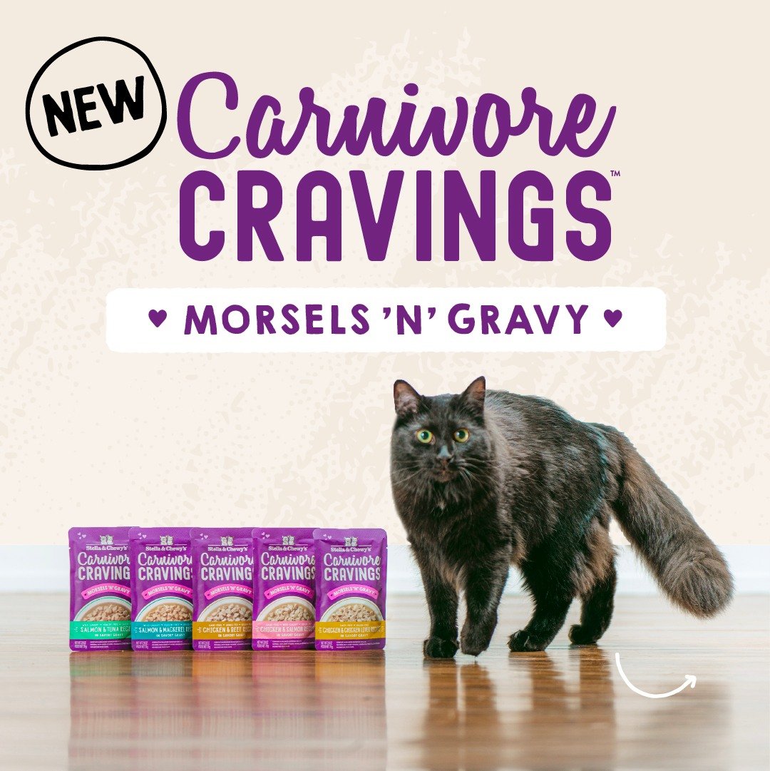
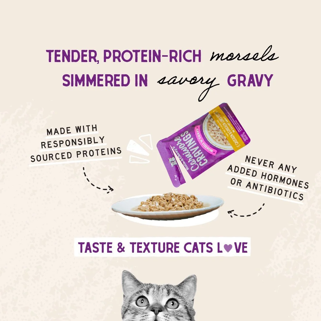
THE CHALLENGE: The objective was to bridge the gap between "Raw, Natural Nutrition" and a "Premium Lifestyle" aesthetic. We needed to communicate the high quality of the ingredients (95% beef, organ, and bone) while making the brand feel approachable, warm, and high-end for a discerning pet parent audience.
THE DESIGN SOLUTION: I developed a visual language that utilized tactile background textures and hand-drawn "sketch" illustrations to anchor the real-world photography. This "hands-on" design approach brought a human, artisanal feel to the digital and print assets, moving the brand away from a purely clinical look toward a more emotional, customer-centric story.
Mixed-Media Composition: I designed social and digital assets that combined high-fidelity product and "pet-hero" photography with organic, hand-drawn graphic elements. These sketches served as visual cues for the "natural and raw" nature of the recipes while adding a playful, energetic layer to the brand.
Textural Depth: By integrating subtle, toothy background textures and paper-grain overlays, I created a "premium-natural" environment for the product. This technical layering ensured that the "Meal Mixers" and "Carnivore Cravings" lines felt distinct and savory, emphasizing the taste and texture that pet parents look for.
Information Hierarchy: I balanced dense nutritional data (like the "95%" callouts) with clean, sophisticated typography. This ensured that the "hard facts" were easily digestible for the customer while the overall "Love them Fully" brand sentiment remained the hero of the composition.